Zaia Health
An AI health assistant's launch page, built in Framer to a fixed external deadline and rebuilt in July when the product pivoted to multiple specialised agents.
Overview
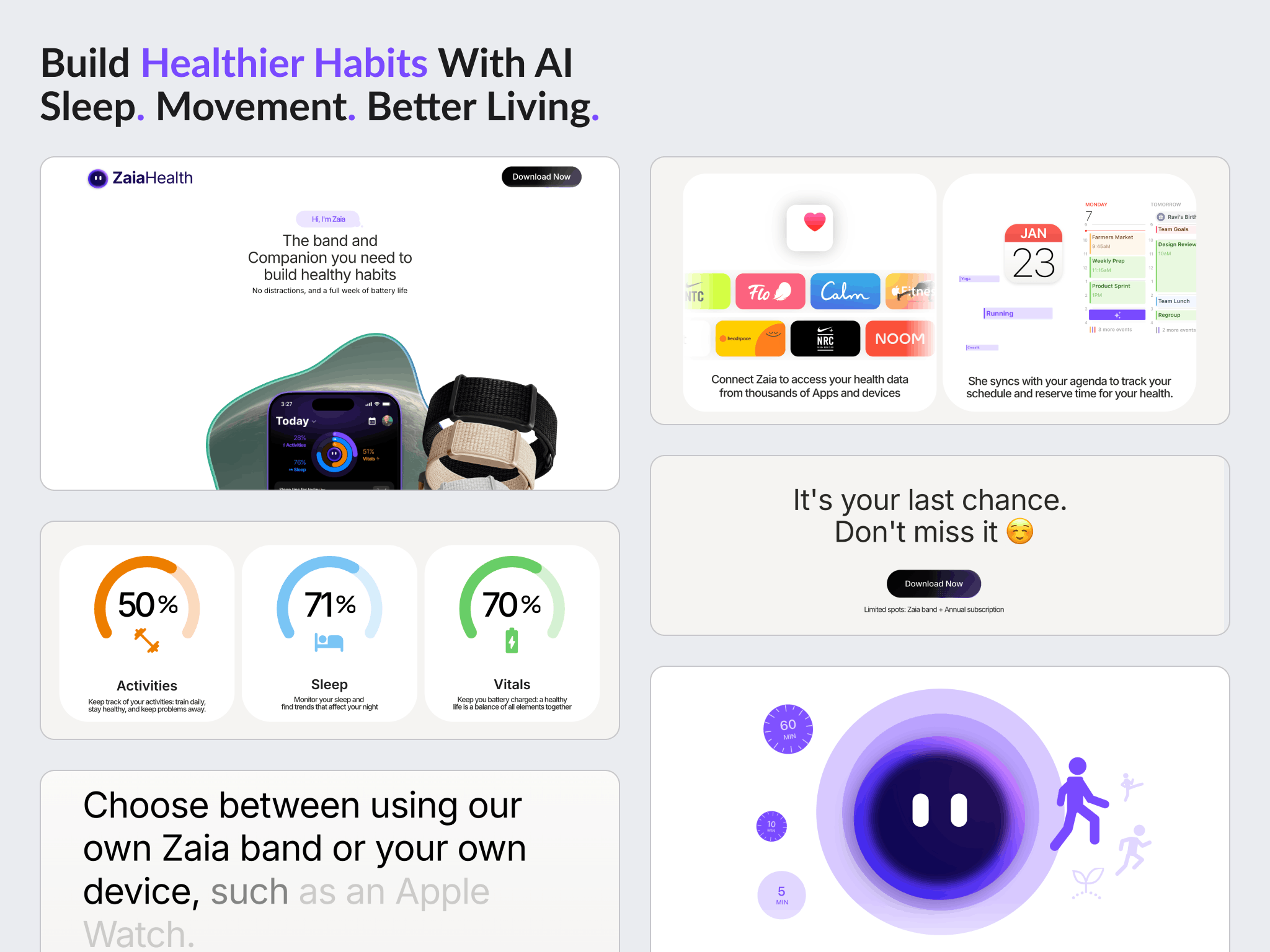
Zaia Health is an AI health assistant for iOS, built by Gustavo Comitre. It reads sleep, stress, recovery and strain, knows the user's calendar, and calls them once a day rather than asking them to log anything or burying them in notifications. It connects to Apple Health, Apple Watch and Calendar.
The name comes from the founder's dog, the one that gets him up for early morning walks.
Shammas Anwer built the site in Framer across two rounds: the original launch page in early 2025, then a second version in July after the product changed shape.
The challenge
A fixed external deadline, not a preferred date. The first build existed to support a funding application with a hard submission date. The page had to be live before it, and that set the scope.
An app that has to be understood before it can be wanted. Zaia does not behave like a tracker. It calls the user, it knows their calendar, and it deliberately does not ask them to log meals. That difference had to land on the page before anyone would join a waitlist.
The product changed underneath the site. In mid 2025 the avatar moved from a dog to an AI, and the single assistant became several specialised agents. The site was describing a product that no longer existed.
No install to send people to, at first. The app ran as a TestFlight beta before it reached the App Store, so the same call to action had to mean a waitlist, then a beta, then a store listing.
Goals
- Ship a launch page in Framer from the supplied Figma before the application deadline
- Explain a daily call health assistant to people who have only used trackers
- Capture a waitlist and give people a reason to pass it on
- Update the site when the product pivoted to multiple agents
- Keep the download path pointing at whatever was current
Approach
Desktop first, deliberately. With a fixed deadline and about a week to work in, desktop was built and approved before mobile started. Building both at half speed risked finishing neither.
Animate the parts that carry the explanation. The hero moves through four header frames, the Apple Health and Calendar section runs as a continuous loop carousel, and the stress and strain sequence plays on its own. The motion is doing explaining that a static screenshot could not.
Make sharing the thank you page's job. The waitlist popup feeds Google Sheets, and the page it returns to is built around sharing to X, WhatsApp and Instagram rather than simply confirming a signup.
Build the call to action for the state after this one. It shipped as Join the Waitlist, designed to become Download on Store once the app was live, and pointed at the TestFlight beta while that was the real install path. Planning for the change cost less than rebuilding it twice.
Rebuild rather than patch for the pivot. The second round brought new logos, new copy, a new opening screen, fresh app screenshots recorded on current devices, and Rive animations including an animated logo. It was staged at a preview path and promoted to the main site once approved.
Type chosen by elimination. SF Pro was ruled out because Apple's licensing does not permit it for website use. IBM Plex and Manrope were tried. Inter was chosen.
Design
The visual design came from the client as a Figma file for the first build. The second round followed the app's new branding.
The primary call to action is #7D4FFF with a drop shadow, the one strong colour on an otherwise restrained page.
Motion carries most of the weight: four hero frames, an auto playing stress and strain sequence, a looping integrations carousel, and in the second version a set of Rive animations including the logo.
A section explaining where the name came from, the founder's dog, was added in the second round.
Build
Built in Framer by Shammas Anwer, twice. The launch page came first in early 2025, then a second version in July.
Implemented in the first round: the hero and section animations, the waitlist popup wired through to Google Sheets, a share focused thank you page, Framer SEO metadata, and the responsive work.
The second round added the Rive animations, the new opening screen, updated screenshots and video supplied by the client's development team, and a download button pointing at the TestFlight beta. Privacy policy and terms run through the CMS and were made responsive on mobile.
Small maintenance continued afterwards, including spacing fixes in early 2026.
Outcome
The launch page shipped in time for the application it was built for, and the site is live at zaiahealth.ai.
The second version went live in July 2025, promoted from its preview path to the main site, carrying the change from a single assistant to a nutritionist, a psychologist and a personal trainer.
The app went out as a TestFlight beta and launched on Product Hunt at the end of July 2025.
No traffic, signup or conversion figures are published here. Zaia Health has not shared performance data, and this work was never measured against a baseline.
Key takeaways
- When the deadline comes from outside the project, sequencing beats working in parallel. Desktop finished and approved first was worth more than two half built breakpoints.
- A product that behaves unlike its category has to be shown rather than described. The motion on this page is explanation, not decoration.
- Build the call to action for the state after the one you are in. The same button had to mean waitlist, then beta, then store.
See it in the browser
The finished site is live. Open it and judge the work in its real context.
Have a project in mind?
Whether you're launching something new or improving an existing website, let's discuss your goals and see if we're a good fit.