Orkun
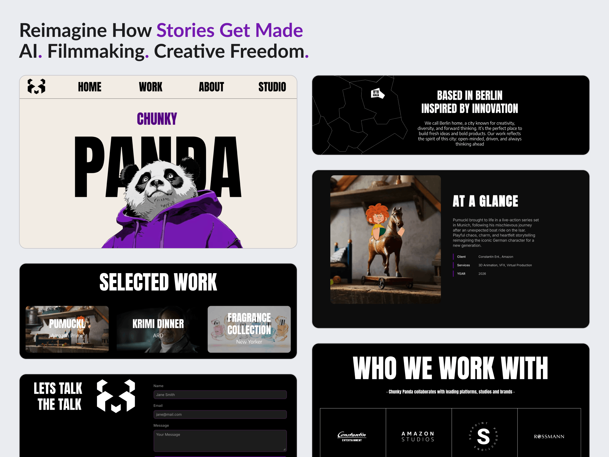
An existing one page Framer site finished properly: responsive behaviour rebuilt, the contact form and map added, and the mascot animation resolved within what Framer can actually do.
Overview
Orkun arrived with a one page site already designed in Framer. The job was not to start it. It was to finish it.
The structure existed and the visual direction was the client's own. What the site did not have was reliable responsive behaviour, a working contact form, or a resolved treatment for the mascot animation he had in mind.
The engagement opened with a paid consultation before any build was agreed, and closed with the Framer project transferred into the client's own workspace.
The challenge
The layout broke below desktop. In the client's words, elements were misaligned or overlapping, especially on smaller viewports, and the layout still needed to be optimized for tablet and mobile screen sizes. There were desktop problems as well.
Hierarchy and spacing were inconsistent. He asked for a review and refinement of the site structure, specifically to improve layout hierarchy, spacing consistency and general responsiveness. That is a structural brief, not a styling one.
Core functionality was missing. There was no working contact form, no map section, and no logo in the header.
The requested animation could not be built the requested way. The client wanted a specific mask based effect for the panda mascot, taken from a reference he supplied. Framer's native tooling does not produce that effect.
The design kept moving. New images, a new contact section and other changes arrived from the client while implementation was under way.
Goals
- Make the site work properly across desktop, tablet and mobile
- Improve layout hierarchy and spacing consistency
- Add a contact form capturing name, company name, email and message, delivered to the client's inbox
- Add the map section and place the logo in the header
- Resolve the mascot animation one way or the other
- Hand the Framer project over so the client owns it outright
Approach
Structure before effects. The animation was the most visible request and the least load bearing. Once it was clear the exact effect would cost disproportionate time, the client agreed to set it aside: We can leave the animations out for now, and concentrate on the structure if possible. That put the responsive and layout problems first, which is where the usability actually sat.
Say what the platform cannot do. The mask based effect in the client's reference is not achievable with Framer's native tools. Rather than approximating it badly and presenting that as the thing, Shammas said so, built a smoother alternative using component variants, and told him the exact treatment was still reachable if he produced it elsewhere and brought it in as video or Lottie.
Stack rather than shrink on mobile. The map and its heading could have been forced side by side on small screens. Compressed into that width the heading would have stopped being readable, so they stack vertically instead. Rearranging beats scaling down.
Treat the client's file as live, not frozen. New images, a new contact section and smaller changes kept arriving mid build. Those were implemented as the current direction rather than held against the version the work started from.
Design
The visual direction was the client's. The work here was structural: hierarchy, spacing consistency, and how the existing composition holds together as the viewport narrows.
On mobile the map section stacks under its heading rather than sitting beside it, which keeps the heading at a readable size instead of squeezing it into a column.
The mascot carries a smooth variant driven transition rather than the mask effect from the original reference.
Build
Built in Framer, on top of the client's existing project file.
Implemented: a contact form capturing name, company name, email and message and sending submissions to the client's inbox, an SVG based map section, the logo in the header, and the mascot animation as component variants.
Responsive work covered desktop, tablet and mobile, with a further pass over the map section and full screen SVG behaviour after the client reported problems there.
At the end the project was handed over as a Framer remix link so the client could copy it into his own workspace and keep full control of it.
Outcome
The site was delivered and the order completed on 5 July 2025, inside an agreed extension, and the Framer project was transferred to the client's own workspace.
The client left a four star review, rating communication, quality of delivery and value of delivery. The same review flagged response time, language fluency and delivery time as areas to improve. Both halves of that belong here.
One issue was still open at handover. The client reported still seeing the entire SVG rather than only part of it, said it was fine and that he thought he could fix it himself. That is where it was left.
No traffic, enquiry or conversion figures are published here. Nothing about post launch performance was shared and this project was never measured.
Key takeaways
- Finishing someone else's file is a different job from starting one. The value sat in structure and behaviour, not in visual direction, and the brief was honest about that from the start.
- When a platform cannot do the exact thing, say so and offer the route that can. An approximation presented as the real thing costs more trust than the limitation ever would.
- The most visible request is not automatically the most important one. Setting the animation aside to fix responsive behaviour first put the effort where the usability was.
See it in the browser
The finished site is live. Open it and judge the work in its real context.
Have a project in mind?
Whether you're launching something new or improving an existing website, let's discuss your goals and see if we're a good fit.