onebyzero
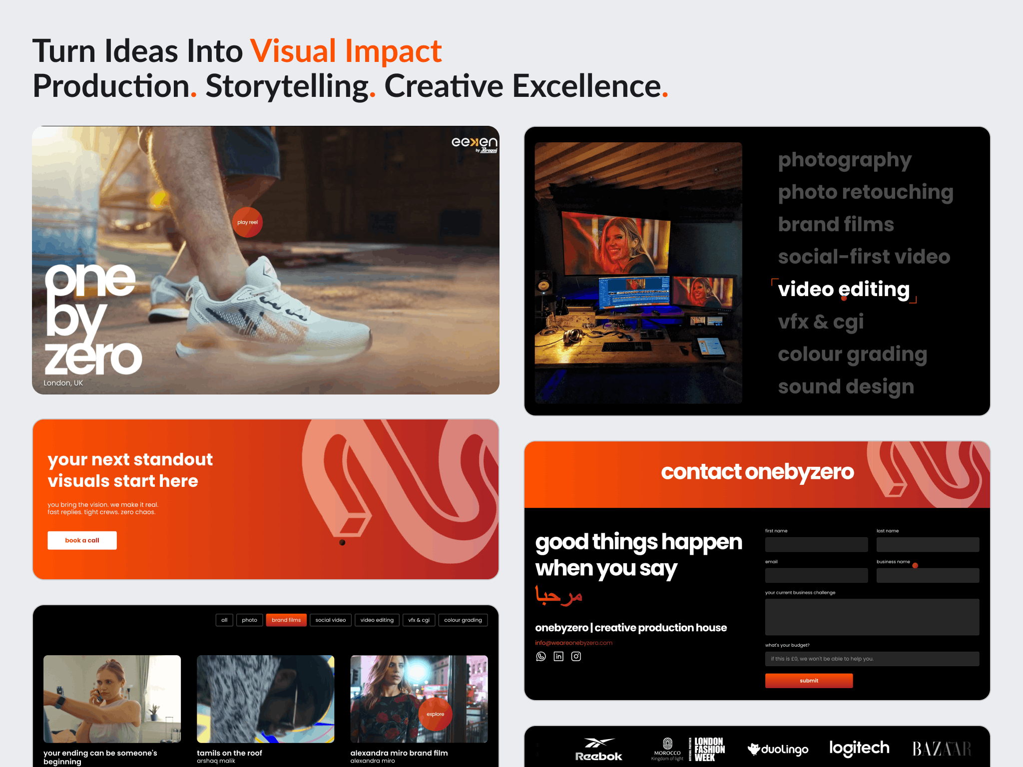
A London creative studio's five page site, designed in Figma and built in Framer, with the project pages set up as a template the team updates themselves.
Overview
onebyzero is a London based production house working with brands and artists worldwide, across photography, video and post production. The studio was called Crave Studio when this site was built, a contraction of creative and brave, and has since rebranded. The website is the same one.
They arrived with the brand already decided: a presentation deck, references, colours, type and the content for the site. What they needed was a five page website that put the work first and that they could keep current without a developer.
This was not the rescue of a failing site. It was a translation problem. A specific creative identity had to become a flexible, responsive, editable website.
The challenge
The work had to lead, not the layout. For a production studio the portfolio is the argument. Imagery, showreel, client logos and project pages all needed room to be seen rather than being fitted around a template's proportions.
The project pages had to be maintainable by the studio. The team expected to change project text and images often, and asked directly whether the project page could work as a template. That turns a page into a content system.
Mobile and tablet were not secondary. The client was explicit that a large share of their audience would see the site on a phone. That raised the bar on the responsive work rather than leaving small screens as a scaled down desktop.
The visual direction was detailed and it kept tightening. Typography and Poppins usage, the lowercase brand treatment, gradients and brand colour, image proportions, project tags, the services section, CTA treatment, footer and mobile navigation were all settled through review rather than agreed up front.
Goals
- Build a five page site around the studio's existing brand direction
- Put the creative work at the centre of the experience
- Make the project pages a reusable template the studio can edit itself
- Carry brand driven interaction rather than a static presentation
- Hold up properly on phones and tablets, not only on desktop
Approach
Design all five pages in Figma before building. The homepage came first, was revised against detailed feedback, and only then did the rest follow. Development did not begin until the client approved the direction on 22 May. With a visual brand this specific, arguing about it in Figma costs hours; arguing about it in Framer costs rebuilds.
Make the project page a template, not a page. This was the client's own request and it is the most useful decision in the project. Project content was structured so the studio could change text and images themselves, which is the difference between a site they own and a site they have to commission changes to.
Give the work more room than a template would. Larger visuals, a prominent showreel, bigger client logos and more space for project content, all requested repeatedly during review, and all correct for a studio whose portfolio is the pitch.
Design the phone navigation separately. The client shared a reference for a side style navigation rather than a conventional dropdown, specifically for phone screens. Small screens got their own navigation pattern instead of a compressed version of the desktop one.
Review during the build, not after it. Pages were shared progressively so the client could respond while development was still moving, using Framer's own comment workflow. They asked for this and they were right: feedback is worth most while it can still be acted on cheaply.
Design
The visual system came from the studio's own brand: Poppins, a lowercase treatment of the name, and gradient and brand colour highlights used as accents rather than as decoration.
Work presentation carries the site. Project imagery, tags and proportions were tuned repeatedly so the portfolio reads at the scale a production studio needs.
Interaction sits on top of that: hover states, text motion, parallax and dynamic elements, an interactive treatment for the services section, a preloader, page transitions and a dynamic footer.
Build
Built in Framer across five pages, from the approved Figma designs.
Project detail pages run on a content structure the studio can edit directly, which was the entire point of building them as a template rather than as individual pages.
Also implemented: a phone specific side navigation, the preloader, hover and transition work, project to project navigation, and the contact page and its form layout.
Responsive implementation covered phone, tablet and desktop, and took longer than anything else in the build.
Outcome
The site was delivered on 19 June 2025 and the order completed on 22 June, five pages in Framer with the project section running as a template the studio maintains itself.
The design was validated as it went. The client's responses through review ran from Thanks Bilal this looks much closer to what we would like to the changes you made look really nice! Good job! We're almost there with the design.
The build was not smooth throughout. Desktop landed early and the client was happy with it, but tablet and phone needed substantial further work, and the client pushed hard on both that and the pace of development. The timeline extended well past the original estimate as a result. That is the honest shape of this project.
It finished at five stars across communication, quality of delivery and value of delivery, with the review also marking going above and beyond and level of cooperation.
No traffic, enquiry or engagement figures are published here. The studio has not shared post launch data and this project was not measured.
Key takeaways
- When a client expects to change content often, the deliverable is the structure, not the page. Building the project section as a template was worth more than any single screen in the design.
- A brand this specific is cheaper to argue about in Figma than in Framer. Designing all five pages to approval before development meant revisions cost hours instead of rebuilds.
- Responsive is not a final pass. Treating phone and tablet as their own design problems from the start would have cost less than fixing them at the end, which is what actually happened here.
See it in the browser
The finished site is live. Open it and judge the work in its real context.
.png)
Have a project in mind?
Whether you're launching something new or improving an existing website, let's discuss your goals and see if we're a good fit.