Kodezi
An AI developer tools company moved onto Framer, where a template starting point was rebuilt into distinct product interfaces for Kodezi CLI, Code and OS.
Overview
Kodezi builds AI developer tools. The product line runs across Kodezi CLI, Kodezi Code for developers, Kodezi OS and Kodezi Create, covering debugging, code generation, documentation, translations, CI/CD, vulnerability detection, ecosystem integrations and autonomous code maintenance.
The brief was a migration. Move the marketing site onto Framer using the Nucleum template, keep the existing Kodezi brand, and present the products more clearly than a template does on its own.
What the project became was considerably more than a migration.
The challenge
One template cannot carry three products. The feature cards that ship with a template say the same thing about everything. Kodezi CLI, Kodezi Code and Kodezi OS each do different work and each needed its own visual argument. The final count was 17 feature cards across the three product pages.
A developer audience needs to see the product. A tools site that only makes claims is not credible to the people evaluating it. The pages needed real interface, dashboards and product states rather than stock marketing graphics.
The useful information sat behind a hover. In the first version of the feature cards, the corrected state appeared only once a visitor hovered. Anyone who did not hover learned nothing about what the feature actually did.
Responsive behaviour needed repeated passes. Cards, pricing, headers, footers, images and UI scaling all needed work across mobile, tablet, MacBook and desktop.
The scope kept opening up. Create, Changelog, further Careers work, new FAQ content and additional sections all arrived after the original brief was set.
Goals
- Move the site onto Framer without losing the existing Kodezi brand
- Give CLI, Code and OS distinct product stories rather than one shared pattern
- Make the site feel product led and interactive rather than static
- Carry pricing, FAQs, integrations, careers, blog and changelog content
- Make the beta, waitlist, contact, sales and support flows actually work
- Hold up across mobile, tablet, MacBook and desktop
Approach
Three products, three card systems. Rather than repeating one visual pattern across the site, CLI, Code and OS each got their own card system carrying their own feature narrative, 17 cards in total across the three pages.
Draw the complex cards in Figma before building them. The feature cards carried most of the animation work, so the concepts were designed in Figma first and then implemented in Framer. That kept the animation phase controlled instead of rebuilding the same component repeatedly inside the live site.
Show the useful state by default. The client made the point that a visitor should not have to hover to understand what a feature does. Shammas changed the default so the informative state is what you see first, with hover kept as an enhancement rather than a requirement. The interaction moved from discover by hovering to understand immediately and explore by interacting.
Cut the animation that was costing more than it returned. Repeated animated SVG tickers were making the page feel sluggish. He identified them as the cause and reduced the repetition, keeping the visual character without the drag.
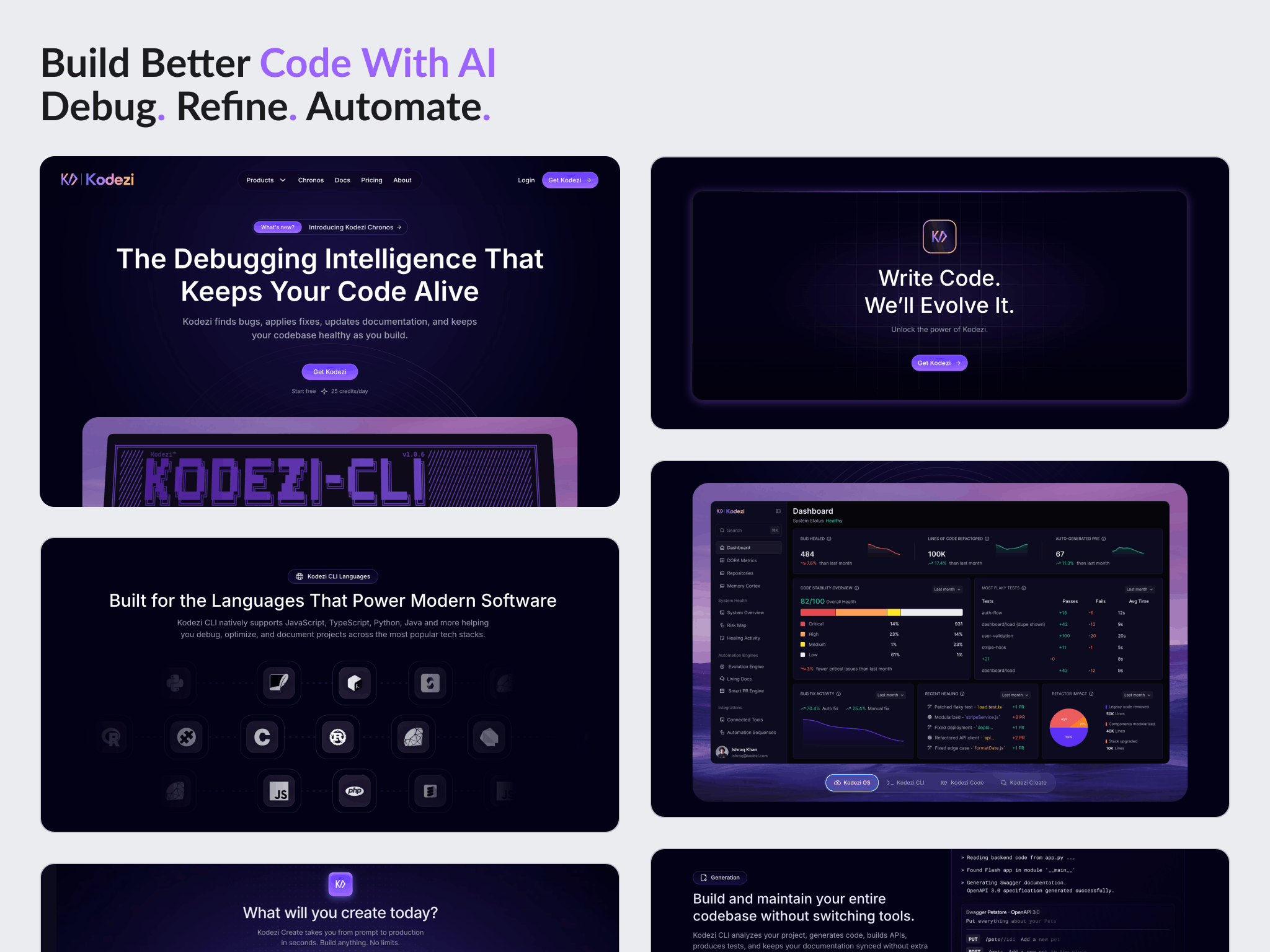
Use the product itself as the visual language. Kodezi's own interface references, dashboards and feature visuals went into the pages in place of generic template graphics, so the site demonstrates the product rather than describing it.
Review on staging, not in screenshots. The client asked for changes to be pushed where they could be inspected directly, and working that way gave every round of feedback something real to react to.
Design
The three product areas read as related but distinct. A shared structure holds the site together while each card system carries its own feature story.
Hero and feature sections are composed around actual product interface, dashboards and UI states rather than abstract illustration.
Interaction work covers the logo animation, button animation, eyebrow hover states, animated feature cards, hover driven UI states, language and logo interactions, dashboard effects and popup interactions.
Build
Built in Framer, starting from the Nucleum template and customized well past it.
Pages and components: the three product pages for CLI, Developers and OS, plus Create, Changelog, About, Careers, pricing, FAQ sections, navigation and calls to action, and 404 elements.
Conversion work covered beta signup and waitlist flows, contact, sales and support form interfaces, submission confirmation states, button and link behaviour, redirects and email routing, with a Google Sheets connection scoped as a later option.
Blog image handling was adjusted in the CMS so listing cards and article pages could take different image requirements instead of sharing one field. Responsive work and cross device QA ran across mobile, tablet, MacBook and desktop throughout.
Outcome
The site was delivered in Framer across the Kodezi product range, with the product pages, supporting pages and conversion flows in place.
The client responded to the interface work directly, saying of the homepage: I saw your animations for homepage, they look good.
The engagement widened as it went. Create and Changelog were added after the original brief, and the client moved progressively more of the site into the work, including Kodezi OS, the Developer page, Careers, pricing, the forms and the responsive QA.
The relationship continued past delivery. In July the client returned with a further Kodezi Framer project, a new landing page, which was completed.
No traffic, signup or conversion figures are published here. Kodezi has not shared post launch data. No page speed measurement was taken either, so no performance figure is claimed.
Key takeaways
- A template is a starting point, not a design. Everything of value in this project sat in what replaced the template, not in the migration itself.
- If understanding a feature requires a hover, most visitors will not understand the feature. Default to the informative state and let interaction enrich it rather than gate it.
- Animation carries a running cost. Repeated animated tickers were quietly making the page feel slow, and cutting the repetition kept the character without the weight.
See it in the browser
The finished site is live. Open it and judge the work in its real context.
Have a project in mind?
Whether you're launching something new or improving an existing website, let's discuss your goals and see if we're a good fit.