EPYTOME
A video agency that wanted to stop looking cheap, redesigned in Figma and rebuilt in Framer around two clearly separated service lines and handed over for the client to run himself.
Overview
EPYTOME is a video agency run by Stanislas, working with B2B clients and specializing in the technology sector. The business covers two different kinds of work: Prod. for filming, pre production, production and post production, and Studio. for motion design and 3D.
The existing website was not carrying any of that. In the client's own description it was cheap, overloaded, disorganized and amateur, and not something he wanted to keep for the long term.
The brief was a full rebuild. Design it in Figma, build it in Framer, and hand it over so he could run it himself afterwards.
The challenge
The site undersold the business. The client wanted EPYTOME to read as a premium agency to a technology B2B audience, and by his own account the existing site read as cheap and amateur. That is a positioning problem before it is a design problem.
Two different businesses presented as one. Prod. and Studio. sell differently and answer different briefs. Collapsed into a single undifferentiated service list, neither was legible.
The obvious visual solution was the wrong one. A video agency site reaches for a showreel background. The client explicitly rejected that. He wanted something impactful, lean, modern and dark, not a video playing behind text.
Discoverability was weak. He reported that searching the company name did not reliably surface EPYTOME, and that Google sometimes read the name as a typo.
He needed to own it afterwards. He asked directly whether he would be able to manage the Framer project and add pages himself once it was handed over. A build he could not maintain would have failed on its own terms.
Goals
- Replace a site the client considered cheap and amateur with a premium, modern one
- Separate Prod. and Studio. so each reads as its own offer
- Position EPYTOME for B2B acquisition in the technology sector
- Build a dark, clean, dynamic visual language rather than a showreel background
- Set SEO up properly at the structural level
- Hand over a Framer project the client can run and extend himself
Approach
Custom design rather than a template. The client first considered a template for speed and budget. The studio proposed designing in Figma and then developing in Framer, and he chose that route because he wanted a site that genuinely represented the company. His approval was explicit: Green light on my end - let's go with the figma + dev option.
Set the visual direction with real work, not adjectives. Premium and modern mean different things to different people. Rather than argue about words, the studio showed earlier Framer projects, and the client responded strongly to one of them, naming its dark visual language, its dynamism and the smoothness of its animation. That gave the direction something concrete to aim at before design started.
Build the architecture around the two service lines. Prod. and Studio. were separated in the structure of the site rather than in its copy alone, so the split shows up in how a visitor moves through the site and not only in what they read.
Put the portfolio in the CMS. Rather than hand building every project page, portfolio and case study content was structured as CMS items so the client could add work himself. That is the difference between a site he owns and a site he has to come back to the studio for.
Leave the search out. Framer's native search would have given a limited experience, so the studio recommended dropping it rather than shipping a weak feature for the sake of having one. The client agreed and it came out.
Keep the blog. The client considered removing it because the traffic it drew was poor quality. The studio recommended keeping it, even in a minimal form, for its potential search value. That was a recommendation about future value, not a measured result.
Design
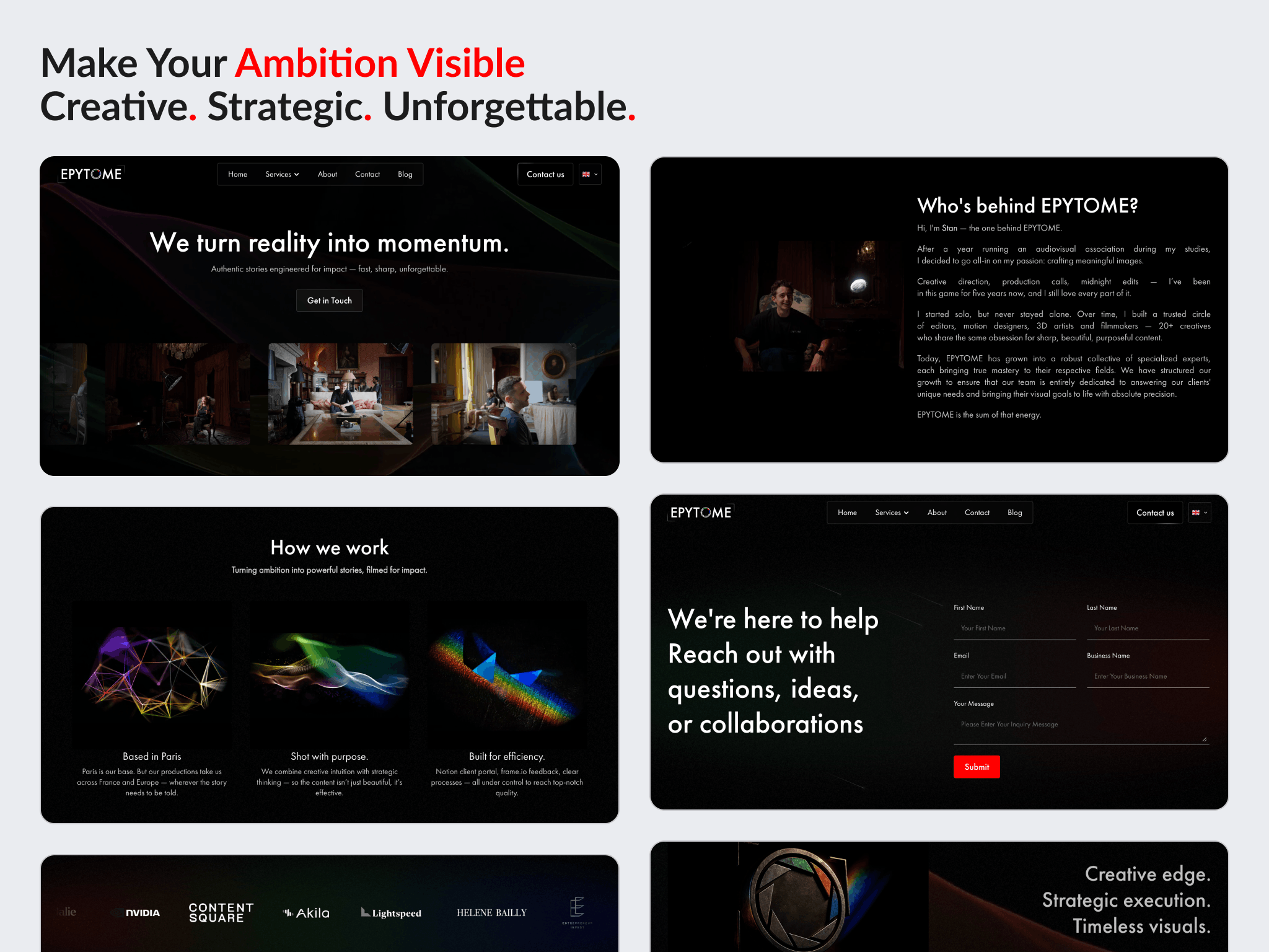
A dark, restrained visual system, built to read as premium without leaning on a full screen showreel.
The two service areas, Prod. and Studio., are presented as distinct territories inside one identity rather than as two items in a service list.
Animation carries the dynamism the client asked for. It sits on top of a clean, modern layout rather than compensating for the lack of one.
Build
Designed in Figma, developed in Framer, with responsive layouts, animations, functional pages, content integration and the visual branding applied throughout.
SEO was configured at the structural level: meta titles and descriptions, alt tags, favicon, Open Graph and social sharing images, a clean URL structure, and Framer's native SEO settings.
Portfolio and case study content runs on CMS structures so new work can be added without a developer. A privacy policy page and the contact form were part of the delivery, and ownership of the Framer project was transferred to the client on completion.
Outcome
The site was delivered and the Framer project handed over, so the client can maintain and extend it himself.
He rated the work five stars across communication, quality of delivery and value of delivery, and the review marked deep understanding, going above and beyond, and level of cooperation. He separately noted a strong command of Framer and a good client relationship.
One real problem surfaced after delivery. The contact form behaved correctly inside Framer's preview but not for public visitors. Shammas traced it and fixed it by reconnecting the variants of the form component, and the client confirmed it was working.
No traffic, ranking, enquiry or page speed figures are published here. EPYTOME has not shared post launch data, no before and after measurement was taken, and the search visibility problem the client described has not been measured again since.
Key takeaways
- When a client says premium and modern, those words carry no shared meaning yet. Showing real work and letting them point at what they respond to settles the direction faster than any amount of description.
- A redesign the client cannot maintain is a redesign that decays. Putting the portfolio in the CMS and transferring the project mattered as much as the visual work did.
- Shipping a weak feature costs more than leaving it out. The native search would have been present but poor, so it went.
See it in the browser
The finished site is live. Open it and judge the work in its real context.
.png)
Have a project in mind?
Whether you're launching something new or improving an existing website, let's discuss your goals and see if we're a good fit.